

The WebAIM Million 2026 Report Is Out — Here’s What the Numbers Actually Mean

Jeffrey Rodgers
March 30 9 min read Image Caption
Every spring, WebAIM publishes its annual analysis of the top one million home pages on the web, scanning each one for detectable accessibility errors. It’s the largest automated snapshot of web accessibility that exists, and it’s genuinely useful data. The 2026 report dropped in late March, and if you work in digital accessibility, you’ve probably already seen the headlines.
The short version: things got worse.
After six consecutive years of slow but measurable improvement, this year reversed that trend. Detected WCAG failures went up. Errors per page went up. The percentage of pages with at least one failure climbed to 95.9%. That’s a lot of red in the spreadsheet.
Before anyone hits the panic button, though, it’s worth slowing down and reading what this data actually represents — and what it doesn’t. Because automated WCAG compliance testing, as valuable as it is, has some real limits that the headlines don’t capture.
What the Report Found
WebAIM scanned one million home pages and found over 56 million distinct accessibility errors — roughly 56.1 errors per page on average. That’s up 10.1% from 2025, when the average was 51 errors per page.
The six most common failure types will look familiar to anyone who does accessibility work:
- Low contrast text (83.9% of pages)
- Missing alternative text for images (53.1%)
- Missing form input labels (51%)
- Empty links (46.3%)
- Empty buttons (30.6%)
- Missing document language (13.5%)
These same six categories have topped the list for seven consecutive years. That consistency is both frustrating and a little clarifying — these aren’t obscure WCAG edge cases. They’re the basics, and they’re still showing up…at scale!
Page complexity also jumped significantly. The average home page now contains 1,437 elements, a 22.5% increase in a single year. Home pages have nearly doubled in complexity since 2019. ARIA usage was up 27% in one year alone and is now six times higher than it was in 2019.
On the category side, government and education sites continue to outperform other sectors. Government pages averaged 42.4 errors — nearly 25% below the overall average. Education came in at 48.9 errors. Shopping and sports sites were among the worst performers, averaging over 70 errors per page.
The report also flagged what it calls “vibe coding” — AI-assisted and automated code generation — as a likely contributor to the spike. The idea being that developers leaning on AI tools to generate front-end code may be inheriting accessibility problems baked into the output. It’s a reasonable hypothesis, though the report offers no data to actually measure it.
What Automated Testing Can and Can’t See
Here’s where it’s worth pressing pause.
The WebAIM Million report uses WAVE, WebAIM’s own automated accessibility testing engine. WAVE is a solid tool. It catches real problems and it’s widely used, including by accessibility teams at organizations that genuinely care about this stuff. Automated testing has a place in any good accessibility workflow.
But automated tools — WAVE included — can only detect somewhere around 30 to 40 percent of actual WCAG failures. The rest require human judgment, assistive technology testing, and real user interaction to surface.
Think about what doesn’t show up in an automated scan: illogical reading order that a screen reader user would have to navigate but looks fine in the DOM, keyboard traps buried inside interactive widgets, confusing focus management in custom components, or alt text that technically exists but describes the wrong thing entirely. An image tagged with alt="photo" passes the automated check.
Assistive tech users still get nothing useful.
Cognitive accessibility barriers — plain language, layout clarity, predictable navigation — don’t register in automated reports at all. Touch target sizing, zoom behavior on mobile, the experience of actually completing a form or checking out of a shopping cart: none of that is captured by scanning a home page with a bot.
This matters because the 4.1% of pages the report identifies as having “no detectable WCAG failures” almost certainly aren’t actually accessible. They just don’t have the specific kinds of errors that automated tools know how to flag. That’s a meaningful distinction, and it’s one the report acknowledges, though briefly.
The ARIA Problem Is More Complicated Than It Looks
One of the more interesting findings in this year’s report is the correlation between ARIA usage and error counts. Pages using ARIA averaged 59.1 errors, compared to 42 errors on pages without any ARIA at all. The report notes this and essentially attributes it to page complexity — pages using ARIA tend to be more complex, so of course they’d have more errors.
That’s probably part of it. But there’s another layer worth considering for developers and web managers reading this data.
ARIA — Accessible Rich Internet Applications — exists precisely because native HTML doesn’t cover every interactive pattern. Custom components, dynamic content, complex widgets: when built correctly, ARIA makes these things accessible. The keyword there is correctly.
The report counts ARIA attributes at scale without distinguishing between ARIA that’s doing exactly what it’s supposed to do and ARIA that’s been misapplied. Take aria-hidden="true" as an example. The report notes this attribute averaged 23.3 instances per page, up 30% from 2025. On the surface, that reads as alarming. In practice, aria-hidden="true" is a legitimate and often necessary technique — We use it to hide decorative icons, redundant interface elements, and content that would create noise for screen reader users if left exposed. Using it intentionally and correctly is actually a good accessibility practice.
Same with role="presentation". If you’re using it to strip the implicit table semantics from a layout table that contains no actual tabular data, that’s the right call. Automated tools flagging these as errors aren’t necessarily catching accessibility problems — they may be flagging accessibility solutions.
The report can tell you how many pages use a given ARIA attribute. It can’t tell you whether those implementations are appropriate for the context. That distinction lives entirely in human review.
The Gaps Worth Knowing About
Beyond the automated testing ceiling, there are a few other things the report can’t address that are worth naming.
The entire study is limited to home pages. For users with disabilities, the most significant barriers are rarely on the home page — they show up on checkout flows, login screens, search results, account settings, and form-heavy pages deeper in the experience. A site can have a relatively clean home page and be essentially unusable once you get past it. The WebAIM Million gives you a useful aggregate picture, but it’s a picture of one page per site.
There’s also no mobile data. Page elements were analyzed from rendered desktop DOMs. Given that the majority of web traffic is now mobile, the absence of any mobile accessibility analysis is a real gap. Touch target sizes, pinch-to-zoom behavior, viewport-dependent layouts — none of this is in the report.
And the data doesn’t include real user or assistive technology testing. A page can pass every check WAVE throws at it and still be disorienting or unusable for someone navigating with a screen reader, voice control, or switch access. Automated tools simulate some of what assistive technology encounters, but they don’t replicate the experience.
The site category data is interesting — and the government sector’s performance is genuinely encouraging for those of us working in that space — but the report used AWS Bedrock AI to classify a million sites into categories. The accuracy of that classification isn’t discussed, which means sector-by-sector comparisons come with an asterisk.
So What Do You Do With This Data?
The WebAIM Million report is still valuable.
It’s the most comprehensive automated snapshot of web accessibility that exists, and the trend data across eight years helps identify patterns that individual audits can’t. If you’re a web manager or developer trying to understand where your site might have low-hanging-fruit problems, running your pages through WAVE or a similar tool is a reasonable starting point. Low contrast, missing alt text, unlabeled form inputs — these are real issues, they affect real users, and automated tools catch them reliably.
The problem isn’t using automated tools. The problem is stopping there.
WCAG compliance testing that relies entirely on automated scanning is, at best, testing roughly a third of what WCAG actually requires. The other two-thirds require someone who knows what they’re looking for to go looking for it — with actual assistive technology, with keyboard-only navigation, with an understanding of how ARIA is supposed to work and what the code is actually doing versus what it appears to be doing on screen.
This is the gap that a lot of organizations don’t fully appreciate until they’ve already invested in an automated tool subscription and assumed the dashboard is telling them the whole story. It isn’t. It’s telling them part of a story, and the parts it leaves out are often the parts that matter most to users with disabilities.
At Accessiblü, our approach is built around this reality. Automated scanning is part of the process — it’s efficient, it’s good at what it does, and it helps prioritize where human review goes first. But it’s the starting point, not the finish line. Real accessibility evaluation involves assistive technology testing across disability types, manual code review, and enough domain expertise to know when ARIA is doing its job correctly and when it isn’t.
The WebAIM Million 2026 results are a useful reminder that the web has a long way to go. They’re also a useful reminder that measuring progress with automated tools alone gives us an incomplete picture of where we actually stand.
The Bottom Line
56 errors per page on average. 95.9% of home pages with detectable failures. Those numbers are worth taking seriously. The six most common failure types haven’t changed in seven years, which means the most fixable problems are still going unfixed at enormous scale.
But a page with zero automated errors isn’t an accessible page. It’s a page where automated tools didn’t find anything — and those two things are not the same.
Understanding that distinction is the first step toward actually improving accessibility rather than just improving your scan results. If you’re not sure where your organization stands, we’re happy to have that conversation.
Jeff Rodgers is the Director of Digital Accessibility at Accessiblü, specializing in ADA compliance, WCAG compliance testing, and managed accessibility operations for government agencies, higher education, and businesses.
 August 29 15 min read
Let’s talk about something: your website’s accessibility statement. If you’re in the C-suite or on the legal team, you’ve probably wondered…...
 June 09 11 min read
If you’ve ever tried to dive into WCAG (Web Content Accessibility Guidelines), you might have felt like you were…...
 May 02 9 min read
May 15th marks Global Accessibility Awareness Day (GAAD), a worldwide event dedicated to raising awareness about digital accessibility and inclusion.…...
 December 13 6 min read
Exciting news in the world of digital accessibility! We’re finally getting some juicy details about WCAG 3.0 – the next…...
 November 08 8 min read
Before joining Accessiblü, I spent 20 years as an instructional designer, accessibility specialist, and LMS administrator in higher education. In…...
 October 28 22 min read
As AI continues to evolve, it’s shaking things up in the world of web crawling and search. AI-powered crawlers are…...
 September 16 9 min read
As the digital space continues to play a crucial role in modern political campaigns, accessibility remains a key concern that…...
April 25 3 min read
Accessiblü Insight This Ablü Insight focuses on how to properly use ARIA (Accessible Rich Internet Applications) labels. This is an…...
 April 28 11 min read
Unlocking the Power of Accessibility: A Guide to Creating Inclusive Websites As web developers, we believe creating an accessible, inclusive,…...
 October 31 11 min read
Over the years of working with businesses on accessibility conformance, we’ve seen the same mistakes made over and over again.…...
 September 23 8 min read
JCC Digital Co-op, and The Jewish Community Centers online compliance for its members....
 September 02 10 min read
Web accessibility and compliance. A businesses websites needs to be compliant with the ADA laws....
 August 19 9 min read
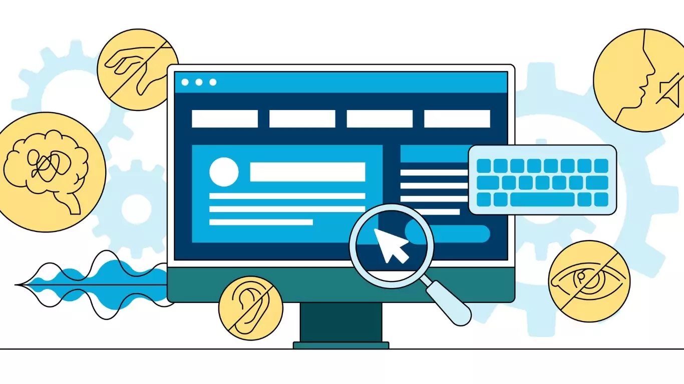
Digital Overlays are not accessible, and are not ADA compliant. Good web design from the beginning or an accessibility audit…...
 August 12 9 min read
Digital Overlays are not accessible, and are not ADA compliant. Good web design from the beginning or an accessibility audit…...