

Accessibility Review of the Campaign Websites for Kamala Harris and Donald Trump

Jeffrey Rodgers
September 16 9 min read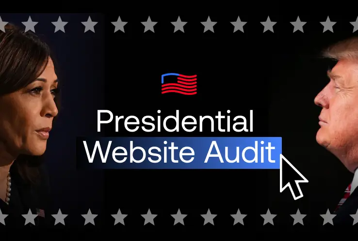 Image Caption
As the digital space continues to play a crucial role in modern political campaigns, accessibility remains a key concern that ensures all individuals, regardless of disability, can participate fully.
Websites are often the first point of interaction between a candidate and a potential voter. For people with disabilities—who rely on assistive technologies such as screen readers or alternative input devices or require specific adaptations like enlarged text or captions—a website that is not accessible can represent a significant barrier to engagement.
Why Accessibility Matters
According to the U.S. Centers for Disease Control (CDC) as much as 28% of the population identifies as having a disability. An inaccessible website can mean that a significant portion of the target audience may run into barriers and not be able to access the site.
We all know that the 2024 election is going to be close. As accessibility advocates, the Accessiblü team wanted to check the accessibility of both candidates’ websites. Our goal is not a political one but rather to see if users of assistive technology can find the information they need to help make an informed choice or support their candidate.
Our Approach
Accessibility on the web is governed by the Web Content Accessibility Guidelines (WCAG), which outline the best practices for ensuring web content is accessible to all users. WCAG focuses on four main principles: Perceivability, Operability, Understandability, and Robustness (POUR). These principles are essential for creating an inclusive digital environment. Unfortunately, many websites fall short of these standards, including those for prominent public figures.
Accessiblü blog: WCAG Explained A Simplified Guide to WCAG
The U.S. Department of Justice has ruled that websites covered by Title II of the Americans with Disabilities Act (ADA) should conform to WCAG 2.1 Level AA criteria. The Accessiblü team measured using WCAG 2.2 Level AA, which includes the WCAG 2.1 criteria.
Federal Registry rule on Title II accessibility
Accessiblü followed our procedure for conducting accessibility audits and user testing for each website. We thoroughly tested each home page and any pages needed to meet our user journey goals, which are listed below.
During the week of September 9th, we compared the accessibility of the websites for Kamala Harris (kamalaharris.com) and Donald Trump (donaldjtrump.com), using both manual evaluations and automated tools. Additionally, user journey tests were conducted on both sites with two primary goals:
- Accessing basic information about the candidate and their policies.
- Attempting to donate by navigating and filling out any required forms.
Kamala Harris Website (kamalaharris.com)
The Kamala Harris campaign website has some significant accessibility challenges that affect people using assistive technologies. These include:
- Heading Structure: The site lacks a logical heading structure. Headings are essential for screen reader users to navigate pages, but the Kamala Harris site skips from H1 to H3, making it difficult for users to understand the content hierarchy. This disjointed structure hampers the user’s ability to follow the flow of information, particularly when looking for candidate policies.
- Modal Dialogs: Pop-up modals, such as those used for newsletter sign-ups or donation prompts, are inaccessible to screen readers. The screen reader fails to announce that a modal has appeared, leaving users unaware of its existence. Additionally, keyboard users cannot easily close these pop-ups because the “Close” button is not in the natural tab order.
- Images and Alt-Text: Many images, including important candidate visuals and infographics, have basic alt+text. We would describe the alt+text we found on the Harris site as better suited as a caption than detailed descriptions of the image.
Descriptive alternative text (alt-text) is crucial for users who cannot see images, as it describes the image’s content and purpose. Without it, users relying on screen readers are left without context for key visuals. - Carousels and Navigation Elements: The product carousel, which showcases campaign merchandise, is not accessible. There are no controls that allow keyboard users or those with mobility impairments to navigate through the items, excluding these users from a significant portion of the site.
- Forms and Feedback: One of the most critical issues occurs during form interactions. Users filling out forms, such as those for donations or volunteer sign-ups, do not receive any feedback indicating the form was submitted. Screen readers fail to announce success or failure messages, leaving users uncertain whether their actions succeeded.
We noticed that the Harris website did appear to change during our testing period. Also, the Harris website does have an accessibility statement, which is a best practice recommended by the W3C. In their statement, they do share an accessibility email to contact with questions and that they are constantly striving to meet WCAG 2.1 AA criteria.
Donald Trump Website (donaldjtrump.com)
The Donald Trump campaign website presents a variety of accessibility challenges that affect users relying on assistive technologies. Some of the key issues include:
- Color Contrast: The Trump website fails to meet the minimum required contrast ratio in several areas, making it difficult for low-vision users to read text against the background. This issue is prevalent on form fields and hover states, where the contrast falls well below the 4.5:1 ratio recommended by WCAG.
- Alt-Text for Images: Unlike the Harris site, most images on the Trump site lack any alt-text. For users who cannot see these images, this lack of descriptive text impedes their ability to understand the visual content, particularly around key campaign moments or policy graphics.
- Keyboard Navigation: While many users can easily navigate a website using a mouse, some users rely on keyboard-only navigation. The Trump site does not consistently allow keyboard users to navigate through interactive elements, such as pop-up modals, forms, and buttons. Focus is often lost, and users need help to close modals or navigate through forms effectively.
- Forms and Labels: Form fields like those in the donation section are missing persistent labels. Labels are critical for users relying on screen readers to understand what each field represents. Without proper labels, it becomes almost impossible for blind or visually impaired users to complete transactions or donate through the site.
We did not find an accessibility statement on the Trump website or anything that identifies how or who to contact with questions about accessibility.
User Journey Tests
The best way to assess a website’s accessibility is to test it with assistive technology. This means manual testing and conducting user journeys with assistive technology. Our lead auditor, Rick Flores, used the Job Access with Speech (JAWS) screen reader with Google Chrome.
The user journeys were conducted to simulate real-world use cases on both sites, aiming to achieve two specific tasks:
- Accessing Basic Information: As users, we tried to find key policy information about each candidate. Both websites presented navigation challenges, particularly for screen reader users who struggled to move between sections due to improper heading structures.
The Kamala Harris website presented difficulties because of its more fragmented heading hierarchy and the keyboard trap we encountered in the donation modal. The trump site took our auditor to an entirely new page without indicating a change of state, and we could not get back. - Making a Donation: We attempted to fill out donation forms. Both sites needed to provide clear feedback after form submission, making users confident about the success of their transaction.
We did note that accessible labels and form instructions were missing, which made the Trump site especially problematic.
Comparison Based on WCAG POUR Principles
1. Perceivability
- Kamala Harris: The site needs to offer better text alternatives for non-text content. Current alt+text may make it difficult for screen reader users to perceive critical information.
- Donald Trump: While there are issues with missing alt-text, the contrast issues further diminish the perceivability for users with low vision.
- Winner: The Harris site outperforms Trump’s in providing visible content, albeit with limited text alternatives that need to be more descriptive.
2. Operability
- Kamala Harris: Keyboard users face numerous obstacles, including difficulty with modals and navigation. However, no keyboard traps were experienced.
- Donald Trump: Major issues with keyboard navigation make the site more challenging to operate for users who rely on non-mouse input. The Trump site’s keyboard traps in modals and lack of operability for focus order issues make it even more challenging for users.
- Winner: Kamala Harris—While both sites have significant issues, the Harris site is slightly more operable for keyboard users.
3. Understandability
- Kamala Harris: Forms on the Harris site do not announce completion or failure, and the content could be more explicit due to the poor heading structure.
- Donald Trump: Similar issues with form feedback and lack of proper labels for form fields hinder understandability.
- Winner: Neither site wins here as both fail to provide understandable feedback to users, especially around forms and submissions.
4. Robustness
- Kamala Harris: The Harris site has some semantic HTML and structure, but the lack of proper labels and roles undermines its robustness.
- Donald Trump: The Trump site similarly needs to be more compatible with assistive technologies, particularly in forms and navigation elements.
- Winner: Neither site performs well in terms of robustness, making it a tie.
Conclusion: Recommendations for Improvement and Overall Winner
Both websites need significant improvements to make them truly inclusive. Accessiblü’s recommendations include:
Kamala Harris Website
- Ensure all images have more meaningful alt-text, particularly in key sections like the candidate’s biography and policy pages.
- Fix the heading structure to create a logical flow that aids screen reader navigation.
- Provide accessible form feedback so users know whether their submissions were successful.
Donald Trump Website
- Improve color contrast to ensure text is readable for users with visual impairments.
- Ensure proper labeling of form fields and improve the keyboard navigation to prevent users from getting trapped in modals.
- Notify users when page states change or users are redirected to new pages.
- Add alt-text to images, especially in policy and campaign areas.
Overall Accessibility Winner: Kamala Harris
While both websites fall short of fully meeting WCAG 2.2 standards, the Harris website edges out the Trump site in terms of accessibility. Though it still has notable issues, it is a bit more operable and perceivable, making it marginally more inclusive for users with disabilities. Additionally, the Harris website includes an accessibility statement and an email address for those with accessibility questions.
However, Accessiblü recommends that both campaigns prioritize accessibility improvements to ensure all voters can engage with their content and participate in the democratic process.
Want to know if your website is accessible but are unsure where to start? Check out our blog on assessing and improving digital accessibility: From Audit to Action: Elevating Your Digital Accessibility.
 September 29 7 min read
I wrote about WCAG 3.0 in December 2024, when it still felt more like a rumor than a real document.…...
 March 30 9 min read
Every spring, WebAIM publishes its annual analysis of the top one million home pages on the web, scanning each one…...
 August 29 15 min read
Let’s talk about something: your website’s accessibility statement. If you’re in the C-suite or on the legal team, you’ve probably wondered…...
 June 23 12 min read
Let’s be honest—diving into WCAG (Web Content Accessibility Guidelines) can feel like trying to read a technical manual written by…...
June 09 11 min read
If you’ve ever tried to dive into WCAG (Web Content Accessibility Guidelines), you might have felt like you were…...
 May 02 9 min read
May 15th marks Global Accessibility Awareness Day (GAAD), a worldwide event dedicated to raising awareness about digital accessibility and inclusion.…...
 April 28 12 min read
In today’s digital landscape, accessibility isn’t just a nice-to-have—it’s increasingly becoming a business imperative. If you’re a CEO, CTO, or…...
 February 11 8 min read
ADA Title II: Understanding the New DOJ Rule: What State & Local Leaders and Businesses Need to Know What the…...
 December 13 6 min read
Exciting news in the world of digital accessibility! We’re finally getting some juicy details about WCAG 3.0 – the next…...
 November 08 8 min read
Before joining Accessiblü, I spent 20 years as an instructional designer, accessibility specialist, and LMS administrator in higher education. In…...
 October 28 22 min read
As AI continues to evolve, it’s shaking things up in the world of web crawling and search. AI-powered crawlers are…...
 September 30 10 min read
Digital accessibility is a critical challenge for many organizations. As an executive, you may be grappling with the complexities of…...
 September 19 11 min read
Digital accessibility is a complex challenge. Businesses often struggle to know where to start, lacking a clear understanding of how…...
September 05 8 min read
Digital accessibility presents a significant challenge for company executives. Many leaders mistakenly view it as a simple fix or an…...
 August 28 9 min read
In today’s digital-first world, ensuring your website, desktop applications, and mobile apps are accessible is not just a matter of…...
 August 28 5 min read
Are you responsible for ensuring digital accessibility on your company’s website, app, or digital assets? Then you know that in…...
July 01 9 min read
In the realm of web accessibility, automated accessibility tools are often hailed as a panacea, promising comprehensive evaluations with the…...
April 25 3 min read
Accessiblü Insight This Ablü Insight focuses on how to properly use ARIA (Accessible Rich Internet Applications) labels. This is an…...
 March 15 12 min read
Knowing what to ask for in an accessibility contract or Request For Proposal (RFP) will help ensure that you get…...
January 23 15 min read
Looking for WCAG explained in a way that’s easy to understand? We know that trying to read and apply the…...
December 11 10 min read
As businesses increasingly recognize the importance of creating inclusive digital experiences, there is a growing demand for manual accessibility audits.…...
 September 18 15 min read
Accessibility is a fundamental aspect that all website owners and developers should consider. Understanding how people with disabilities navigate the…...
 September 01 10 min read
There’s been a buzz about the new WCAG 2.2 update for over a year now. After a series of delays,…...
 June 09 10 min read
Ensuring web accessibility is crucial for creating inclusive digital experiences that enable people with diverse abilities to access and interact…...
 April 28 11 min read
Unlocking the Power of Accessibility: A Guide to Creating Inclusive Websites As web developers, we believe creating an accessible, inclusive,…...
 April 24 11 min read
Accessibility laws can be confusing, especially when determining which standards apply to each business. Suppose you are starting to investigate…...
 October 31 11 min read
Over the years of working with businesses on accessibility conformance, we’ve seen the same mistakes made over and over again.…...
 September 23 8 min read
JCC Digital Co-op, and The Jewish Community Centers online compliance for its members....
 September 02 10 min read
Web accessibility and compliance. A businesses websites needs to be compliant with the ADA laws....
 August 19 9 min read
Digital Overlays are not accessible, and are not ADA compliant. Good web design from the beginning or an accessibility audit…...
August 12 9 min read
Digital Overlays are not accessible, and are not ADA compliant. Good web design from the beginning or an accessibility audit…...