

WCAG Level A: The Foundation of Digital Accessibility That Every Developer Should Master

Shannon Nix
June 23 12 min read Image Caption
Let’s be honest—diving into WCAG (Web Content Accessibility Guidelines) can feel like trying to read a technical manual written by lawyers who moonlight as engineers. But here’s the thing: Level A criteria aren’t just bureaucratic checkboxes. They’re the foundation that prevents your website from being completely unusable for millions of people. And if you’re a web manager or developer tasked with fixing accessibility issues, understanding these criteria is your starting point for meaningful change.
Why Level A Is Your Non-Negotiable Baseline
Think of WCAG conformance levels like building codes for digital spaces. You wouldn’t construct a building without exits, right? Level A is essentially saying, “Hey, let’s make sure people can actually get in and out of your digital building without getting trapped.” It’s the absolute minimum for accessibility—the floor, not the ceiling.
Here’s what makes Level A special: failing these criteria often means your site is flat-out unusable for someone. We’re not talking about minor inconveniences; we’re talking about complete barriers. When a screen reader user encounters an image without alt text that contains critical information, they’re stuck. When a keyboard user hits an element they can’t escape from (hello, keyboard traps!), they literally cannot continue using your site.
At Accessiblü, we see Level A issues as immediate red flags during our testing process. While our managed accessibility approach addresses all conformance levels simultaneously, Level A failures are the “stop everything and fix this now” category. Let’s dive into the key criteria that make the biggest impact.
Images and Alternative Text (1.1.1 Non-text Content)
What Auditors Look For
When testing for WCAG conformance, auditors zero in on every single image, icon, and graphical element. They’re checking whether each visual element has appropriate alternative text that serves the same purpose as the image itself. This isn’t just about slapping a description on everything—it’s about equivalent functionality.
Auditors will use screen readers to navigate through your content, listening for how images are announced. They’ll flag:
- Missing alt attributes entirely
- Placeholder text like “image” or “picture”
- File names being read aloud (IMG_2847.jpg, anyone?)
- Overly verbose descriptions when simplicity would suffice
- Decorative images that aren’t properly hidden from assistive technology
How to Conform
Here’s where it gets practical. For informative images, write alt text that conveys the same information the image provides visually. If you have a graph showing quarterly sales increases, don’t write “graph”—explain what the graph shows: “Bar graph showing 25% sales increase from Q1 to Q2.”
For decorative images, use empty alt attributes (alt=””) to tell screen readers to skip them. This is crucial—leaving out the alt attribute entirely is different from having an empty one. Without any alt attribute, screen readers might read the file name or try to guess what the image contains.
<!-- Good: Informative image -->
<img src="sales-chart.png" alt="Sales increased from $2M in January to $2.5M in February">

<!-- Good: Decorative image -->
<img src="decorative-swirl.png" alt="">

<!-- Bad: Missing alt -->
<img src="important-info.png">

<!-- Bad: Unhelpful alt -->
<img src="ceo-headshot.jpg" alt="headshot of Pete Czech smiling. He has dark hair and a short dark beard.">
Common Failures
The most painful failures we see? Complex infographics with alt text that just says “infographic about our process.” That’s like putting a sign on a door that says “door”—technically true but utterly unhelpful. Another classic: using CSS background images for important content without providing any text alternative. If it conveys information, it needs an accessible alternative, period.
Page Structure and Headings (1.3.1 Info and Relationships)
What Auditors Look For
This success criterion is about ensuring that information conveyed through visual presentation is also available programmatically. Auditors examine whether your visual hierarchy translates into proper semantic structure. They’ll check:
- Are headings marked up as actual headings (h1-h6) or just bold text?
- Do heading levels follow a logical order?
- Are lists marked up as lists or just text with bullet characters?
- Do data tables have proper headers and relationships defined?
- Are form labels properly associated with their inputs?
Testing tools will scan for heading structure, and manual testers will use screen readers to navigate by headings, confirming the page makes sense when visual styling is stripped away.
How to Conform
Use HTML semantic elements for their intended purpose. This isn’t about visual appearance—it’s about meaning. A heading isn’t just big, bold text; it’s a structural element that organizes your content.
<!-- Good: Proper heading structure -->
<h1>Product Documentation</h1>
  <h2>Getting Started</h2>
    <h3>Installation</h3>
    <h3>Configuration</h3>
  <h2>Advanced Features</h2>

<!-- Bad: Visual styling without structure -->
<p style="font-size: 24px; font-weight: bold;">Product Documentation</p>
<p style="font-size: 18px; font-weight: bold;">Getting Started</p>
For forms, always associate labels with their inputs using the for attribute or by nesting the input within the label:
<!-- Good: Explicit association -->
<label for="email">Email Address</label>
<input type="email" id="email" name="email">

<!-- Also good: Implicit association -->
<label>
  Email Address
  <input type="email" name="email">
</label>

<!-- Bad: No association -->
<label>Email Address</label>
<input type="email" name="email">
Common Failures
The worst offender? Using heading tags for visual styling rather than document structure. We’ve seen h4 tags used for small bold text throughout a page with no h1, h2, or h3 in sight. Screen reader users who navigate by headings get a completely broken experience. Another frequent failure: placeholder text used as the only label for form fields. Once a user starts typing, that “label” disappears, leaving everyone (not just screen reader users) confused about what information belongs in that field.
Keyboard Navigation (2.1.1 and 2.1.2 Keyboard and No Keyboard Trap)
What Auditors Look For
Keyboard testing is refreshingly straightforward—auditors literally unplug their mouse and try to use your site. They’re checking whether every interactive element can be reached and activated using only the keyboard. More critically, they’re making sure users can escape from any element they enter.
Testers will tab through your entire page, looking for:
- Can every link, button, form field, and interactive widget be reached?
- Is the focus indicator visible so users know where they are?
- Can all functionality be triggered via keyboard?
- Can users tab away from every element (no traps)?
- Do custom widgets follow expected keyboard patterns?
How to Conform
Start with native HTML elements whenever possible—they come with keyboard support built in. Links, buttons, and form elements just work. When you must create custom interactive elements, add proper tabindex values and keyboard event handlers:
<!-- Good: Native button (keyboard accessible by default) -->
<button onclick="submitForm()">Submit</button>

<!-- Good: Custom element made keyboard accessible -->
<div role="button"
     tabindex="0"
     onclick="submitForm()"
     onkeydown="if(event.key === 'Enter' || event.key === ' ') submitForm()">
  Submit
</div>

<!-- Bad: Click-only div -->
<div onclick="submitForm()">Submit</div>
For preventing keyboard traps, be especially careful with:
- Modal dialogs (users should be able to escape with Esc key)
- Embedded content like videos or maps
- Custom dropdown menus
- Any widget that manages its own focus
Common Failures
The classic keyboard trap happens in poorly implemented modal dialogs where focus cycles through the modal’s elements but never escapes. Users get stuck in an infinite tab loop. Another common failure: making elements clickable but not keyboard accessible. That fancy CSS-styled div that looks like a button but has no keyboard support? That’s a Level A failure that leaves keyboard users completely blocked.
Parsing and Valid Code (4.1.1 Parsing)
What Auditors Look For
This criterion ensures your HTML is well-formed enough that assistive technologies can reliably interpret it. Auditors run your code through validators and examine the DOM for:
- Duplicate IDs (a surprisingly common issue)
- Improperly nested elements
- Missing required attributes
- Unclosed tags
- Malformed attribute syntax
While modern browsers are forgiving of HTML errors, assistive technologies might not be. Parsing errors can cause screen readers to misinterpret or skip content entirely.
How to Conform
Write valid HTML. It sounds simple, but it requires discipline, especially in complex applications. Use automated validation tools during development:
<!-- Good: Unique IDs, proper nesting -->
<nav id="main-nav">
  <ul>
    <li><a href="/">Home</a></li>
    <li><a href="/about/">About</a></li>
  </ul>
</nav>

<!-- Bad: Duplicate IDs, improper nesting -->
<nav id="navigation">
  <ul>
    <a href="/"><li>Home</li></a>
    <li id="navigation">About</li>
  </ul>
</nav>
Set up your build process to catch these errors before they hit production. A linter can catch most parsing issues during development, saving you from fixing them after an audit.
Common Failures
Duplicate IDs are the silent killer here. They often come from copying and pasting code blocks or from JavaScript that dynamically generates elements without ensuring unique identifiers. Another frequent issue: improperly nested interactive elements, like putting a button inside a link. Browsers might render it, but screen readers can behave unpredictably.
Name, Role, Value (4.1.2)
What Auditors Look For
This criterion ensures that user interface components have names and roles that can be programmatically determined. Auditors check whether assistive technologies can understand:
- What each element is (role)
- What it’s called (name)
- What state it’s in (value/state)
They’ll use screen readers to interact with every control, listening for whether elements are announced correctly. Is that toggle switch announced as a toggle with its current state? Does that custom dropdown identify itself as a combobox?
How to Conform
Again, native HTML elements win here. They come with built-in roles and handle their own state announcements. When creating custom widgets, use ARIA attributes thoughtfully:
<!-- Good: Native checkbox (role, name, and state handled automatically) -->
<label>
  <input type="checkbox" checked> Subscribe to newsletter
</label>

<!-- Good: Custom toggle with proper ARIA -->
<button role="switch"
        aria-checked="true"
        aria-label="Enable notifications">
  <span class="slider"></span>
</button>

<!-- Bad: Custom control with no semantic information -->
<div class="toggle active" onclick="toggle()">
  <div class="slider"></div>
</div>
For complex widgets, follow established ARIA patterns. Don’t reinvent the wheel—the ARIA Authoring Practices Guide has patterns for almost every common widget type.
Common Failures
The biggest failure? Custom form controls that look beautiful but tell assistive technologies nothing about what they are or what state they’re in. That sleek custom dropdown might visually show it’s expanded, but if it doesn’t programmatically communicate that state, screen reader users are flying blind.
Implementing Level A in the Real World
Here’s where Accessiblü’s approach differs from traditional audit-only services. While other companies hand you a list of Level A failures and wish you luck, we know that’s like giving someone a recipe in a language they don’t speak. Our managed accessibility ops model means we’re identifying and fixing these issues concurrently.
When our team spots a Level A failure during testing, we don’t just flag it—we provide the exact code fix and work with your developers to implement it correctly. We’ve found this approach dramatically reduces the time from discovery to resolution, especially for Level A issues that are blocking users entirely.
WCAG Conformance: It’s a Journey, Not a Destination
Level A conformance isn’t a one-time achievement you can frame on the wall. Websites are living entities—every update, every new feature, every content addition is an opportunity for new accessibility barriers to creep in. This is why we advocate for treating accessibility like security: it requires ongoing vigilance and expertise.
The good news? Once you understand these Level A principles, they become second nature. You’ll start catching potential issues during development rather than after launch. You’ll write semantic HTML by default. You’ll test with your keyboard as naturally as you test with your mouse.
Your Next Steps
Start with a keyboard test of your own site. Right now. Unplug your mouse and try to navigate your homepage. Can you reach everything? Can you tell where you are? Can you escape from every element you enter? This simple test will likely reveal several Level A issues you can fix today.
Remember, Level A is your foundation, but it’s just the beginning. WCAG conformance includes Level AA (and sometimes AAA) criteria that address more nuanced barriers. But you can’t build a stable house on a shaky foundation—nail your Level A compliance first, then build up from there.
At Accessiblü, we believe accessibility isn’t about perfection; it’s about progress. Every Level A fix you implement removes a barrier for someone trying to use your site. That’s not just good compliance—that’s good business and good humanity.
Want to ensure your site meets WCAG Level A criteria and beyond? Let’s talk about how our managed accessibility approach can help you move from reactive fixes to proactive accessibility operations. Because in the end, WCAG conformance isn’t about passing an audit—it’s about ensuring everyone can use what you’ve built.
Ready to transform your approach to digital accessibility? Contact Accessiblü to learn how our unique managed ops model can help you achieve and maintain WCAG conformance without the endless audit cycle. Let’s build a more inclusive digital world together.
 September 29 7 min read
I wrote about WCAG 3.0 in December 2024, when it still felt more like a rumor than a real document.…...
 November 05 12 min read
You’ve just spent hours building the perfect grade tracker in Excel. Color-coded rows show which students are excelling (green) versus…...
August 25 15 min read
By Shannon (Conformance Specialist & Front End Developer) and Rick (Lead Auditor & AT User), Accessiblü Digital accessibility extends far…...
 July 29 14 min read
By Shannon Nix, Lead Conformance Specialist, and Rick Flores, Lead Auditor at Accessiblü You know that moment when you think…...
 July 24 23 min read
Picture this: you’ve spent weeks perfecting your website’s accessibility on desktop, making sure every button is keyboard navigable and every…...
June 09 11 min read
If you’ve ever tried to dive into WCAG (Web Content Accessibility Guidelines), you might have felt like you were…...
May 22 14 min read
We’ve been knee-deep in accessible multimedia training sessions lately, and wow—there’s so much to know to get this right! With…...
 May 02 9 min read
May 15th marks Global Accessibility Awareness Day (GAAD), a worldwide event dedicated to raising awareness about digital accessibility and inclusion.…...
 April 28 12 min read
In today’s digital landscape, accessibility isn’t just a nice-to-have—it’s increasingly becoming a business imperative. If you’re a CEO, CTO, or…...
 February 11 8 min read
ADA Title II: Understanding the New DOJ Rule: What State & Local Leaders and Businesses Need to Know What the…...
 December 13 6 min read
Exciting news in the world of digital accessibility! We’re finally getting some juicy details about WCAG 3.0 – the next…...
 September 30 10 min read
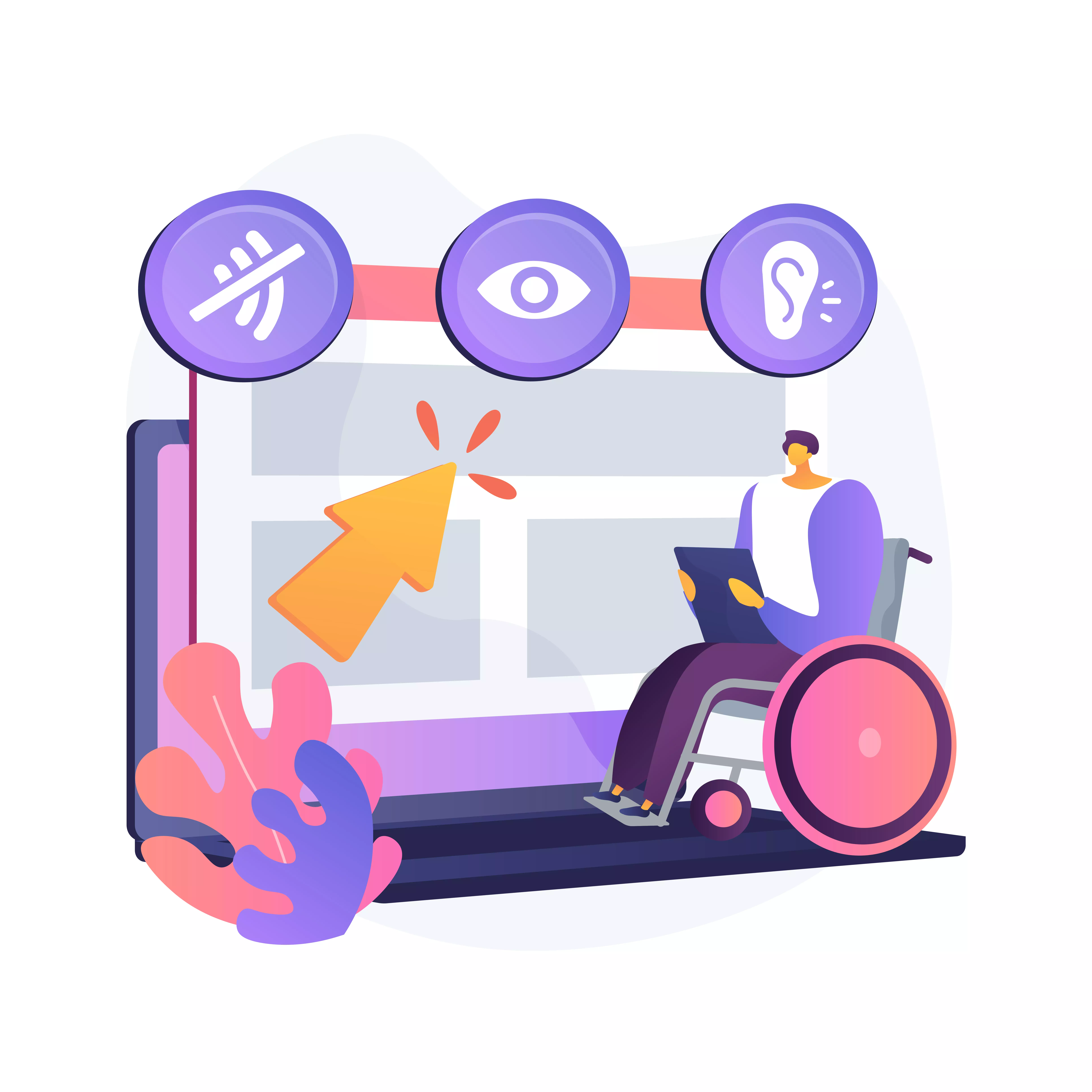
Digital accessibility is a critical challenge for many organizations. As an executive, you may be grappling with the complexities of…...
 September 19 11 min read
Digital accessibility is a complex challenge. Businesses often struggle to know where to start, lacking a clear understanding of how…...
 September 16 9 min read
As the digital space continues to play a crucial role in modern political campaigns, accessibility remains a key concern that…...
 September 05 8 min read
Digital accessibility presents a significant challenge for company executives. Many leaders mistakenly view it as a simple fix or an…...
 August 28 9 min read
In today’s digital-first world, ensuring your website, desktop applications, and mobile apps are accessible is not just a matter of…...
 August 28 5 min read
Are you responsible for ensuring digital accessibility on your company’s website, app, or digital assets? Then you know that in…...
 July 01 9 min read
In the realm of web accessibility, automated accessibility tools are often hailed as a panacea, promising comprehensive evaluations with the…...
April 25 3 min read
Accessiblü Insight This Ablü Insight focuses on how to properly use ARIA (Accessible Rich Internet Applications) labels. This is an…...
 March 15 12 min read
Knowing what to ask for in an accessibility contract or Request For Proposal (RFP) will help ensure that you get…...
October 11 11 min read
In today’s digital age, understanding WAI-ARIA roles is crucial for mastering web accessibility. It ensures that websites and web applications…...
 September 18 15 min read
Accessibility is a fundamental aspect that all website owners and developers should consider. Understanding how people with disabilities navigate the…...
 September 01 10 min read
There’s been a buzz about the new WCAG 2.2 update for over a year now. After a series of delays,…...
 June 09 10 min read
Ensuring web accessibility is crucial for creating inclusive digital experiences that enable people with diverse abilities to access and interact…...
 October 31 11 min read
Over the years of working with businesses on accessibility conformance, we’ve seen the same mistakes made over and over again.…...
 September 23 8 min read
JCC Digital Co-op, and The Jewish Community Centers online compliance for its members....
 August 27 9 min read
Digital accessibility, universal access, and web design are opportunities for good web design....
August 19 9 min read
Digital Overlays are not accessible, and are not ADA compliant. Good web design from the beginning or an accessibility audit…...
August 12 9 min read
Digital Overlays are not accessible, and are not ADA compliant. Good web design from the beginning or an accessibility audit…...